

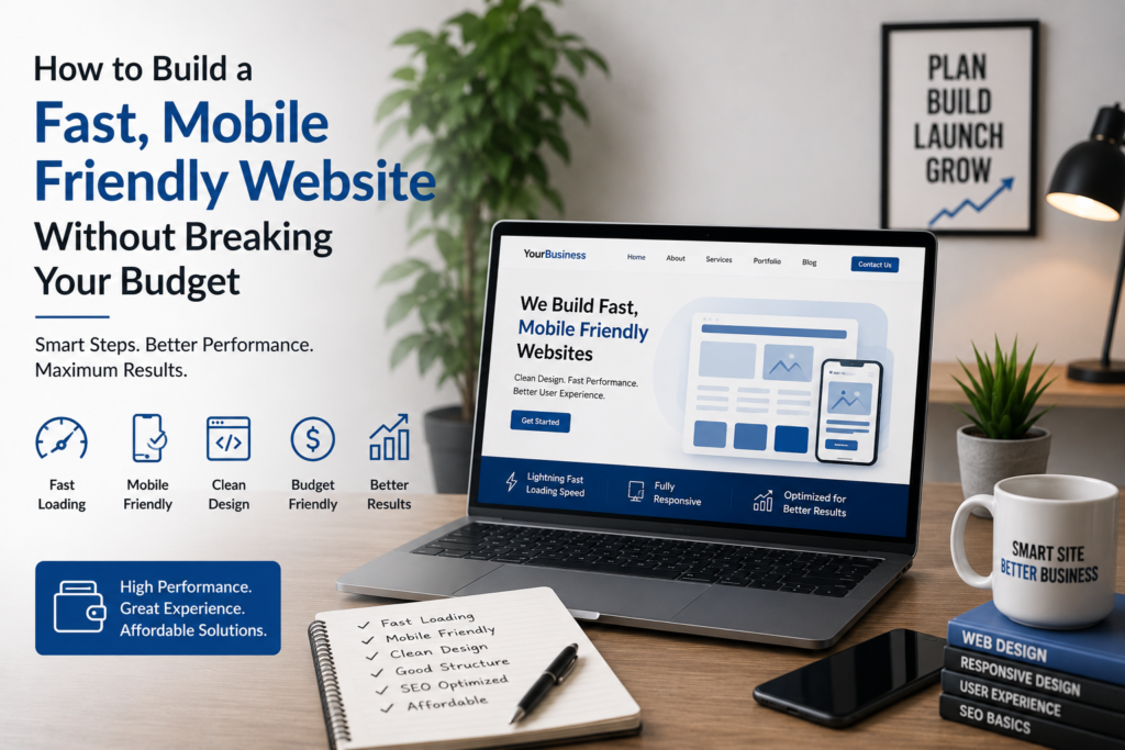
In today’s digital-first world, your website is the digital storefront of your business. If it takes too long to load or looks broken on a smartphone, prospective customers will hit the back button within seconds.
The good news? Building a high-converting, responsive website doesn’t require thousands of dollars or complex coding.
Here is a simple, step-by-step guide to creating a fast, mobile-friendly website while staying strictly within your budget in 2026.
Step 1: Choose a Lightweight, Fast WordPress Theme
Your theme dictates your website’s overall speed and layout. Avoid heavy, multi-purpose themes that come pre-packed with unnecessary code and flashy animations.
- Best Free Options: Choose lightweight themes like Astra, GeneratePress, or Kadence.
- Why it matters: These themes load in under 1 second, automatically adapt to all mobile screen sizes, and are fully optimized for search engines.
Step 2: Use Reliable, Managed Web Hosting
Your web hosting server is the engine behind your site’s speed. Choosing the absolute cheapest hosting can often lead to frequent downtime and sluggish loading times.
- Budget Tip: Look for affordable starter plans on trusted hosts like Hostinger or SiteGround.
- Key Features to Check: Ensure your hosting includes free SSL (HTTPS), built-in server caching, and 99.9% uptime.
Step 3: Compress and Optimize Your Images
Uncompressed, heavy images are the #1 reason websites take forever to load on smartphones.
- Resize Before Uploading: Never upload raw photos directly from a phone or camera.
- Use Modern Formats: Convert your PNGs/JPEGs into WebP format using free online tools like TinyPNG or Squoosh.
- Enable Lazy Loading: Make sure lazy loading is enabled so images load only when a visitor scrolls down to view them.
Step 4: Keep Your Plugins to a Minimum
Plugins add great features, but running too many will slow down your site’s response time and create security risks.
- Stick to Essentials:
- Caching & Speed: LiteSpeed Cache or WP Rocket
- SEO: Yoast SEO or Rank Math
- Security & Forms: WPForms and Wordfence
- Rule of Thumb: Try to keep your active plugin list under 15 for optimal performance.
Step 5: Design for Mobile First
More than 60% of total web traffic comes from smartphones. Always check how your layout looks on mobile screens before hitting publish.
- Thumb-Friendly Navigation: Make sure buttons and menu items are large enough to be easily tapped with a thumb.
- Readable Fonts: Keep your text size at 16px or higher so users don’t have to zoom in to read your content.
Summary Checklist
- Select a speed-optimized theme (Astra / GeneratePress).
- Host on a fast, dependable server.
- Compress every image before uploading.
- Limit your plugin count.
- Test every page on your mobile phone!